The Farm Branding
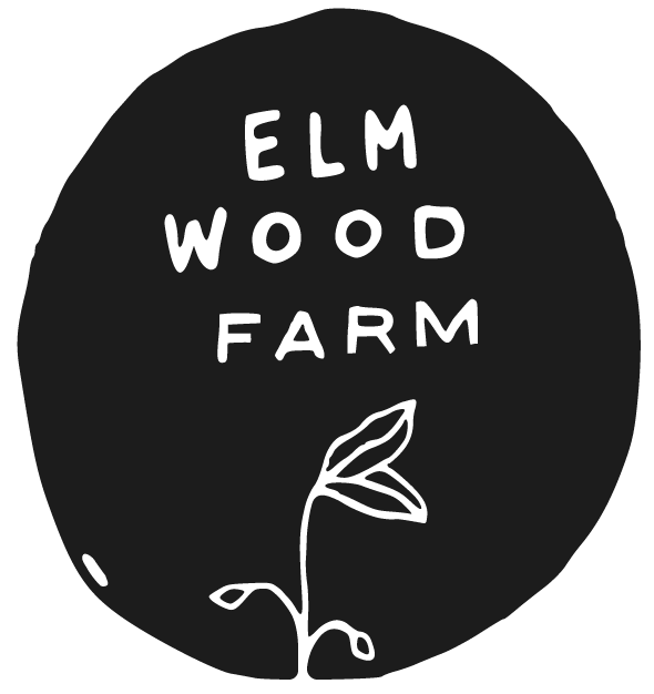
Elmwood Farm is drawn out in waving letters to represent the characteristics of imperfection and graciousness through the primary mark. The hand-lettering resembles that of a carved name in the trunk of a tree. A budding Elm tree is to the left to indicate new growth and the surrounding history of the Elmwood neighborhood.
The two supporting icons provided are indications of the greens grown and the “livestock” kept at Elmwood Farm. A vine of tomatos and a single baby chick can be used throughout design layouts for print and web as well as paired with primary design marks.
The traditional illustrated style compliments the imperfection of the primary mark while developing a sketchy but bold aesthetic for future icons to be introduced.


